Tabla de contenido
Hello! Today we are back with another python article. This time about how to create graphs with python and matplotlib.
Matplotlib is a library that offers many possibilities to create python graphics from data arrays. The official website of this library is: https://matplotlib.org/
We appreciate if you share this article in your social networks and/or comment.
Let’s get started!
Installation of libraries
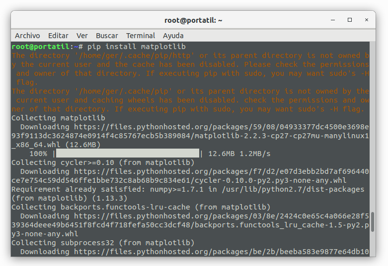
To install matplotlib we only have to execute pip install matplotlib as you can see in this screen:
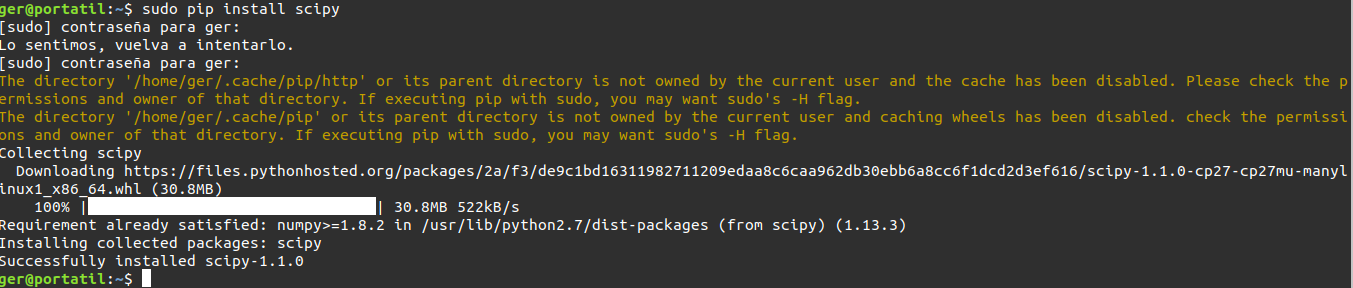
In order to be able to work with the examples shown below, we must also install scipy with the command pip install scipy:
And we must also install python-tk in the case of debian/ubuntu and similar is done with apt install python-tk:

Basic line graphs
In this first example we are going to make simple graphs defining only the “Y” axis with the data we want to plot:
ger@ger:~$ python
Python 2.7.15rc1 (default, Apr 15 2018, 21:51:34)
[GCC 7.3.0] on linux2
Type "help", "copyright", "credits" or "license" for more information.
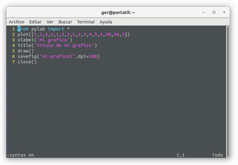
>>> from pylab import *
>>> plot([1,2,3,2,1,3,2,1,2,3,4,5,4,30,10,1])
[]
>>> xlabel('mi grafico')
Text(0.5,0,'mi grafico')
>>> title('titulo de mi grafico')
Text(0.5,1,'titulo de mi grafico')
>>> draw()
>>> savefig("mi-grafico1",dpi=300)
>>> close()
>>>
With this code above we create a graph in python based on the data defined in the second line (the one that begins with plot). To show you how it works we have created a python file in /tmp/grafico.py with this code and executed it:
Here you can see that the file does not exist until it is executed:
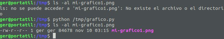
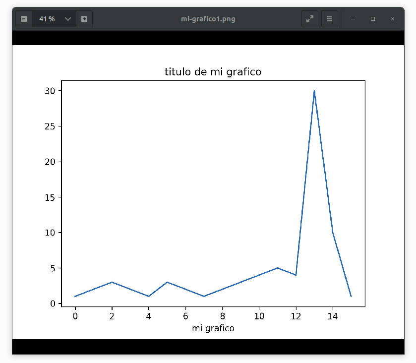
After creating the chart when we open it, we can see this:
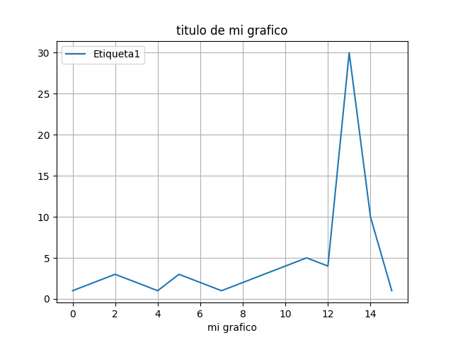
By changing part of the code you can make a GUI window with the generated graphic be displayed, this is done with the draw() statement:

If we add before draw() the statement grid(True) the background grid will be displayed. To display the legend we must add legend( (‘Label1’,), loc = ‘upper left’) where “Label 1” is the text to display:
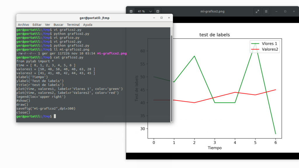
If we want to complicate the simple line chart a little more, we can add a timeline and a second line of data:
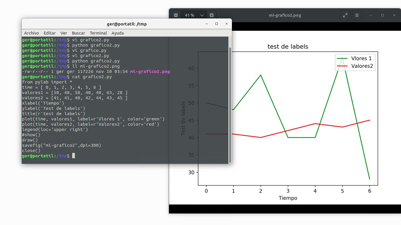
In the previous case we have been able to define the color and the text of the label of each line. This is done by modifying the parameters “color” and “label”. In this case as we have used legend(loc = ‘upper left’) the legend acquires the values of the label parameter of the plot() statement. In this case we could have also used legend( (‘Vlores 1′,’Valores2’), loc = ‘upper left’) but the sentence used is more convenient because we avoid passing parameters and these are acquired automatically.
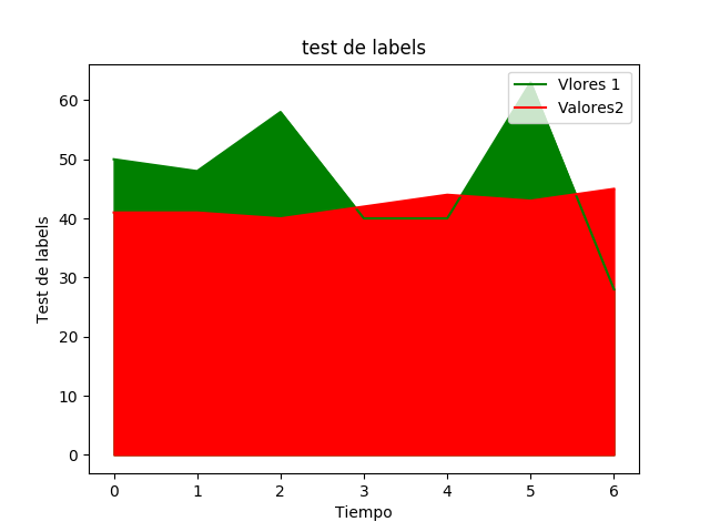
Area charts
It is as simple as adding the fill_between(time,values2,color=”red”) statement (where we also define the fill color of the area) for each line of a simple chart:
And this is the result of the area graph:
3D graphics
With the following code we generate a 3D graph with the data provided in X and Y, the X axis is provided in the first parameter of np.arange:
from pylab import *
from mpl_toolkits.mplot3d import Axes3D

fig = figure()
ax = Axes3D(fig)
X = np.arange(-8, 30, 0.50)
Y = np.arange(-8, 20, 0.50)
X, Y = np.meshgrid(X, Y)
R = np.sqrt(X**2 + Y**2)
Z = np.sin(R)

ax.plot_surface(X, Y, Z, rstride=1, cstride=1)
show()
The result is:
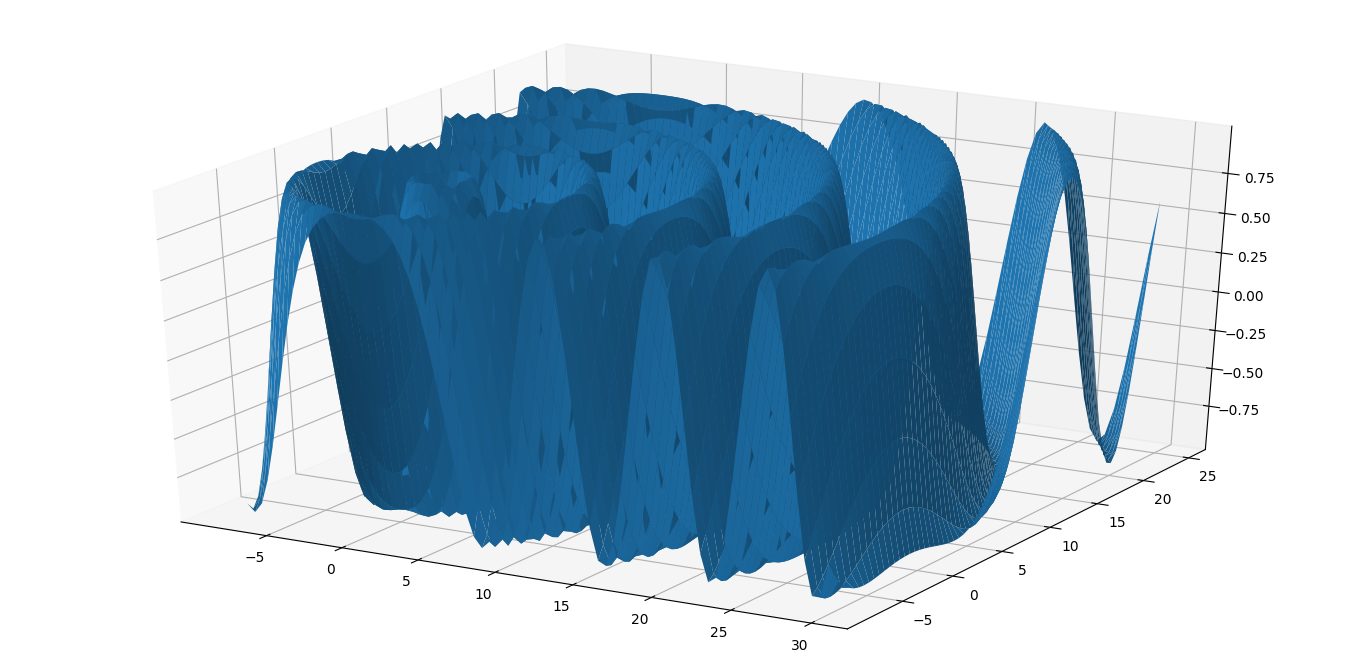
If we want to change the colormap we can modify ax.plot_surface(X, Y, Z, rstride=1, cstride=1) for example:
ax.plot_surface(X, Y, Z, rstride=1, cstride=1, cmap=’hot’) this statement will set some warm colors and if we want some cool colors we can use “cool”.
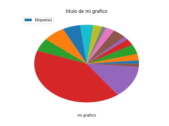
Pie” or “Pastel” type graphics
In this last section we show how to generate a pie chart.
from pylab import *
y = [1,2,3,2,1,3,2,1,2,3,4,5,4,30,10,1]
pie(y)
xlabel('mi grafico')
title('titulo de mi grafico')
legend( ('Etiqueta1',), loc = 'upper left')
draw()
#savefig("mi-grafico1",dpi=300)
#close()
grid(True)
show()
If we substitute pie(y) for plot(y) we generate a line graph. The commented lines if uncommented, will save the plot directly apart from displaying it with show() . The result of this code is:
And that’s all. You can find more information on how to make other types of graphs such as bar charts in the documentation of the official web site https://matplotlib.org/
If you liked the article you can comment or share it on your social networks.
See you soon!